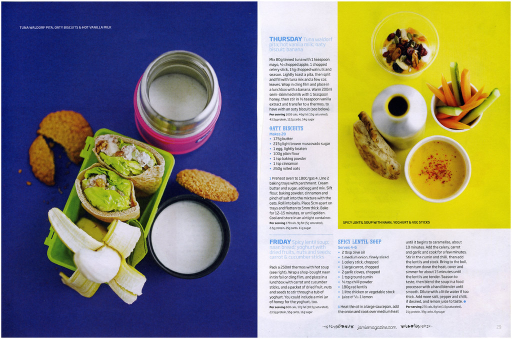
Pages 28-29 of Jamie Magazine's Issue #8 captivates me. No doubt, the art director or the food stylist or the photographer of this spread must have taken colour theory classes; the bold contrast of blueberry violet with lemon yellow is simply striking. From its playful typography, to its textured {non-glossy} paper, Jamie's Mag stands out from all the other food mags out there, at least from a design standpoint. The mag just emits this vibe that food need not be pretentious, but rather, fun and funky and accessible to all. Hoorah.

No comments:
Post a Comment