Showing posts with label design. Show all posts

Mar 11, 2013

Typography in Braunschweig


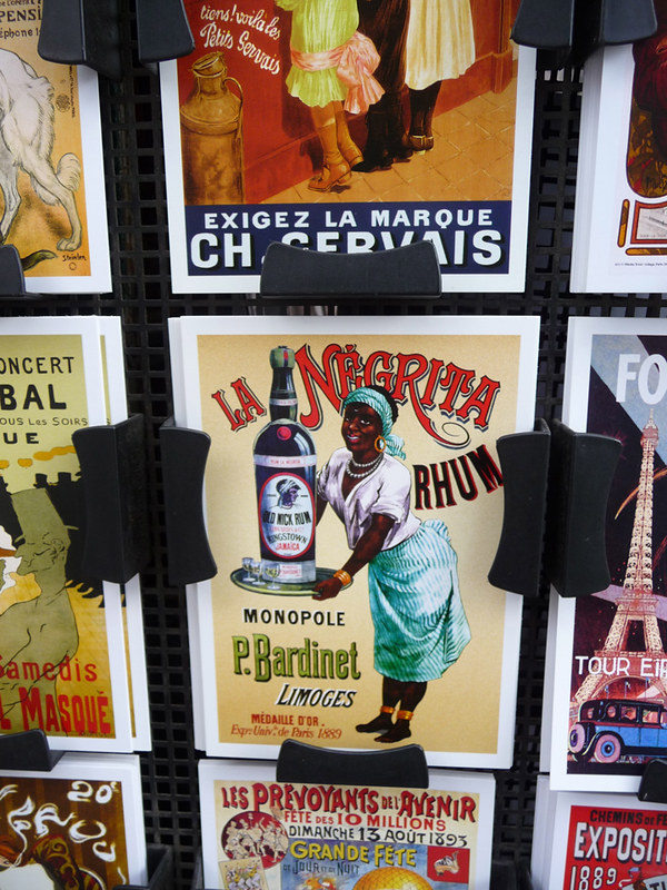
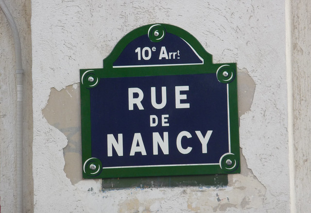
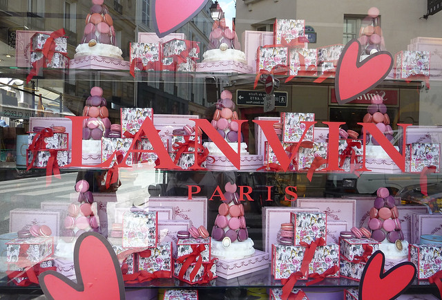
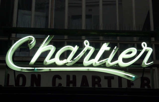
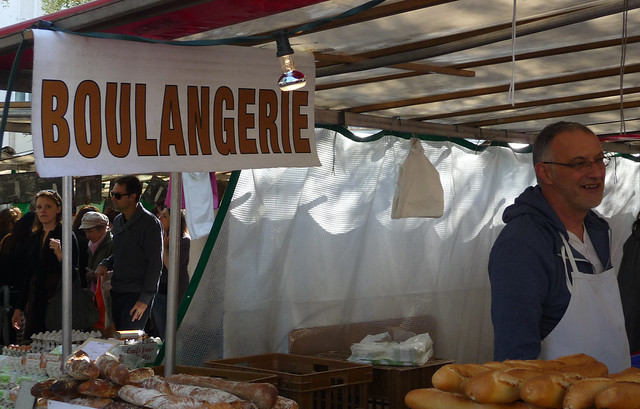
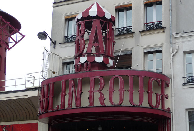
A few months ago, I did a post called #TYPELOVE #PARIS. Well it's about time I featured some of the kool-lookin' typography here in our little city! The typefaces they use on public buildings here are just so unlike the typefaces I grew up seeing in North America. Dare I say they have better taste o'er here? ...with a preference for classicism, I might add.

Mar 2, 2013

#YOLO


I have not purposely intended to bust a Drake up in here. Nor do I think this postcard's a stunning example of typography at its best (I found it in the foyer of a local bar/resto here in Braunschweig). It's all about the message, really. I'm feelin' the message and I'll continue to endorse it for as long as I live.

Feb 18, 2013

The Poster in Our Kitchen


It was a long time coming but I'm so happy with how the print turned out! The bf's main argument was, "Why take all these photos of food if you don't actually do something with them?!" That's how I ended up designing a simple visual of some of our MMMs (Most Memorable Meals). Not all were successful. Some were strange experiments that we'd never cook again, some were decent imitations of my mom's Filipino dishes, others were crazy German concoctions... 2-3 years ago I couldn't cook for sh.t! Proud to say I've learned a thing or two since then. ;) Btw, this poster is humungo. 120 cm x 86 cm.

Nov 1, 2012

#TYPELOVE #PARIS


Bondz and I are such typography nerds. Inspired by my sissy's Type-Fiendin' in Paris et Roma post, here's some more of that type ish to get you all hot and bothered. Taken sometime last month during our 4-day jaunt 'round one of the most visited cities in the world, I feel like these photos capture tiny glimpses into what Paris is all about. She's brash and overrated but I love how she's also grimey yet dainty and oh-so-cosmopolitan. Wanna know what's b-b-badass? Madeleines from a vending machine.

Sep 5, 2012

we see what we want #Nyood #Toronto


... NOT WHAT WE ARE. [oldie but goodie photo taken sometime when I last visited Tdot - Jan 2012?]

Jul 18, 2012

Quarkbälle Typografie

Untitled

#hamburg #fischmarkt #quarkbälle #zimt #zucker #typografie #lila #juli #2012

Apr 4, 2012

Doppio Concentratu di Pomodoro — Marca Bianca & Marca Rossa


Lovely example of packaging design, oder? I could get all OCAD-y and argue that there needn't be all that CAPS LOCK text at the bottom of both tubes... but I love the aesthetic of them, so whatever. Although these products are from Italy, here in Germany, tomato paste products are typically sold in tubes too. Still, I've yet to see kickass tomato paste tubes here. Wanna know how to make an easy pasta sauce? Squeeze 1/2 tube tomato paste into a pot of 500g passata (sieved tomatoes) & simmer.

Jan 25, 2012

Thanks, Rosie!

I'm such a sucker for anything homemade. That's why I went straight bananas when this card was handed to me. Examining it in my hands with a mixture of excitement and shock, I'd forgotten how much I loved the feel of construction paper and how much I missed being crafty. #aleenescrafts

rosiescard

Much love to Rosie for being so thoughtful, and a big fat "You're Welcome" for the tees, etc. Respect for getting creative wit' it, girl! You've inspired me! I'm itching to create something fun outta funky-coloured construction paper now! PS. The image on the left was the front of the card, and the image on the right was one of the pages inside the card. Do we see a designer in the making here, people?

May 28, 2011

Butter Goods Clothing Co.


What are our thoughts on the design of this logo, folks? Hmmmmmmmmmmm hella kerned or what??!

Nov 4, 2010

Feed Your Self

feedyourself

Upon initial glance, I thought this mini-poster alluded to something serious. Then I went to the website, http://please-help-your-self.com. All it is is a buncha t-shirts with "Feed Yourself" screen-printed on 'em. Conceptually, I'm not impressed. I like the dripping ice cream cone image, but what does it have to do with telling people to feed themselves? And the typography's soooo cliché man. It's been done.

Oct 24, 2010

Trader Joe's NYC - 14th St - Yummy Typography

traderjoessign

Photographer: Andrea Pascual | Always a longass line to check-out at either of the two Trader Joe's locations in Manhattan. While waiting, sis got a lil camera-happy. Yay for that!

Sep 9, 2010

I ♥ CHEESE

ilovechz

Like my collage-y photograph mash-up? The rugged blue background is a close-up shot of one of the bright, colourful walls at L'Avenue Restaurant in Montréal. Several days after having had breakfast at L'Avenue, I ♥ CHEESE scrawled in chalk on some parking metre caught my eye. Isn't it awesome? I'm totally writing + drawing I ♥ CARROT all over Toronto now. Watch out, graffiti po-lice.

Sep 6, 2010

Fiona Hewitt — Wu & Wu | DumplingDynasty.com

bigbagofjoy

My sis copped this bag from a store in NYC's Chinatown for somethin' like $12 USD. She quickly became obsessed with its kitschy aesthetic; so, too, did I. After weeks of pestering, she finally found time to scan images of the bag for me (shakes fist). The illustrator's name is Fiona Hewitt, and I ♥♥♥ her illustrative style! It's quirky, fun, bizarre-o and indeed "oddly delicious." Haha how sick is it to call your website Dumpling Dynasty??! And check out this Baking Kit yo, isn't it toooooo hard to resist? Oh, and before I forget, watch this >>> ROCKIN' THE BAG OF JOY... SICK BOSS! Bwahahahahaha!

Aug 23, 2010

Foodhaterism


Foodhaterism. Ya'll know what it is. Quite literally, foodhating encompasses anything and everything having to do with the act of hating in relation to food. Chefs who get irate when guests bust out their cameras in restaurants to take pictures of their food? FOOD H8RS! People who aren't open-minded enough to try cultural cuisines they've never tried before? FOOD H8RS! Pretentious folk (i.e. the snobby old man host at Babbo Ristorante in NYC) who have the audacity to give a guest attitude after she had inquired about the wait time for a table? FOOD H8RS! In all my exasperation, I've designed a FOOD H8RS SUCK logo. Are there any examples of Foodhaterism that make YOUR blood boil??!


Aug 8, 2010

Shelley Pascual — OCAD Thesis 2009

[logo]


Relish is a concept. I designed this logo to brand the concept of Relish. One day, Relish will exist.

[full book layout; mock-up]


After one semester at OCAD of nothing but research, throughout my second Thesis semester, I came to the conclusion that one's multicultural experience of visiting Relish could be best communicated in the form of a hand-made book.

[front flaps of book; mock-up]


At Relish, one can learn to cook foods from any country in the world. Each country in Relish is represented by a little kitchen, as well as an expert cook waiting to teach eager students the cultural dishes of their respective countries. Essentially, Relish is a large, open-air place where people can come together to experience food. Whether its strolling the aisles watching other cooks in action, hangin' out at one of the lounges, purchasing a hot meal to-go, or learning how to cook an authentic cultural dish, Relish is THE cooking school of the future.  

[back flaps of book; mockup]

On the back of the flaps, there's all kinds of fun tidbits of helpful food-y info.

[final book]  

On either side of the pop-up flaps in the center of the book, I've written (and laid-out typographically) a fictional story of one person's multi-sensory experience of entering Relish for the very first time. This person sees, smells, hears, tastes and touches everything that is Relish.

[logo printed on book's spine]

Printed onto the spine of my home-made book is the Relish logo. If there really existed a place even remotely similar to Relish today, would you believe it? 'Cause I sure as heck wouldn't! How awesome would it be to learn how to cook dishes from any cuisine anywhere in the world, and to do this all in one place?! That's what I'm talkin' 'bout... CONCEPTS!