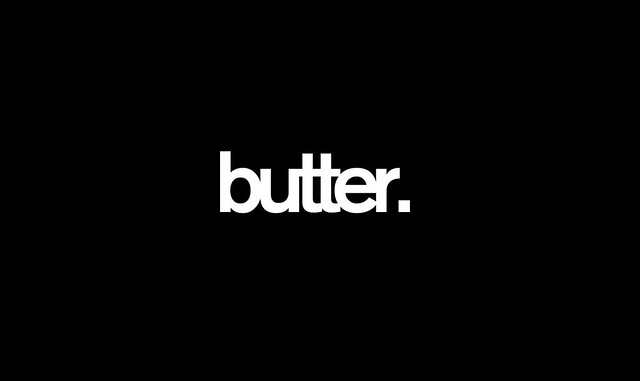
What are our thoughts on the design of this logo, folks? Hmmmmmmmmmmm hella kerned or what??!

Unless otherwise indicated,
all graphics, photographs,
media and content found on
this website are property of
shelleypascual.com and
should be used with proper
credit. All Rights Reserved.
not my cup of tea. it is too dark and scary.
ReplyDeletenot interested at all.
Hahaha @ "too dark and scary." I think using black and white is takin' the safe route. It's typical when designers don't know what colour to use. For me, the logo just doesn't FEEL like butter. I ain't feelin' all buttery inside.
ReplyDeleteI am not on the artistic state of mind. sorry for being negative.
ReplyDelete